How to Choose a Color Palette for Your Custom Wood Sign
You’ve booked a paint party with friends from Downers Grove, Hinsdale, or the surrounding suburbs. You’ve picked out your design, and you’re ready to get creative! What’s the next step? Choosing a color palette for painting your sign.
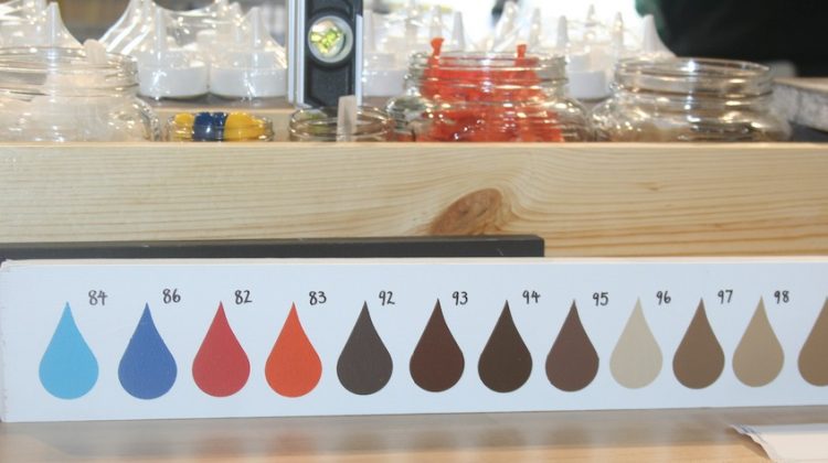
You’ll find a variety of paint colors and wood stains to choose from at the henn house. You can opt to keep the colors the same as the original design or you can pick your own colors. But how do you choose a color palette?
5 Tips for Choosing a Color Palette for Painting
1. Favorite colors: One simple way to create your color palette is to pick your favorite colors. This ensures that you’ll love your color choices, and it makes it easy on you. Pick your top three to four favorites and get to work!

2. Match home or office: Are you making a sign for your home or office? Does the room already have a color scheme? Another option for your palette is to choose colors that match or complement the room. If your living room is decorated in blues and grays, or your office is black and white, you might want to choose shades in those colors for your handpainted sign.
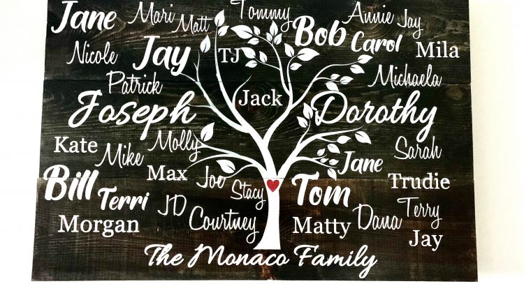
3. Choose a Current Palette: If you have a special event coming up that already has a color palette, you can use those colors. For example, if you’re getting married and making a sign for the wedding, opt for your wedding colors. Or if you’re making a baby shower gift and you know what colors are in the nursey, you can use those for inspiration.
4. Let your heart guide: If you don’t have any colors that are your particular favorites and you don’t have a current color scheme in mind, let your heart be your guide! Instead of planning in advance, take a look at the colors available when you arrive and make some spontaneous decisions.
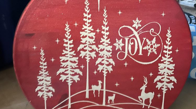
5. Use the design: Some colors work better with certain images and quotes than others. For example, if you’re making a sign with a relaxing quote for your bedroom, you might want to use a light green or yellow instead of bright red or orange. If you’re making a kid’s sign, you might pick lively primary colors.
Ready to put these tips to use? We can’t wait to see what you create! Don’t forget to share your creation with family and friends on Facebook and Instagram using @thehennhousedecor!